Operator Dashboard
Operator Dashboard
Operator
Dashboard
UI/UX Case Study
Duration : 2-3 weeks
Overview
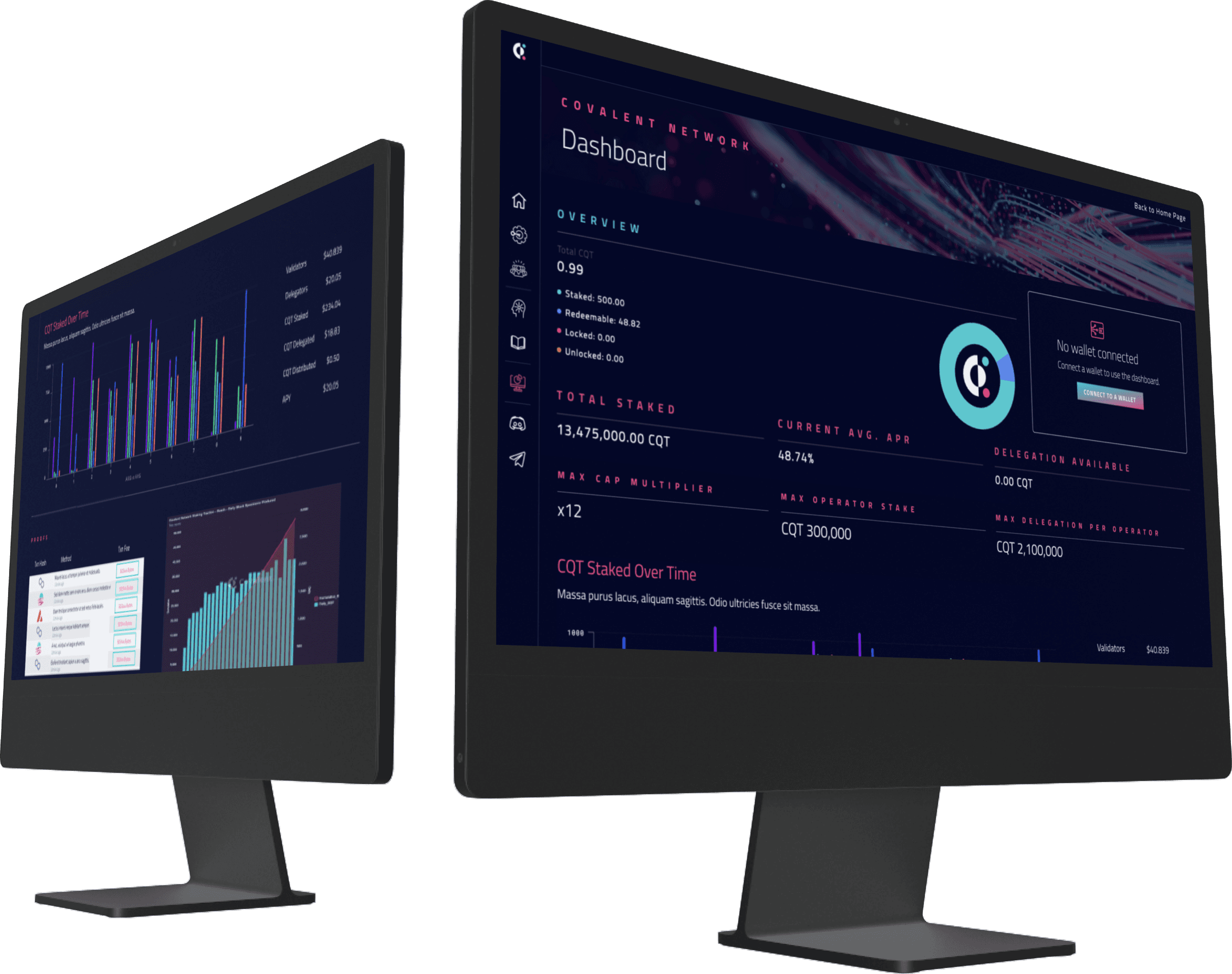
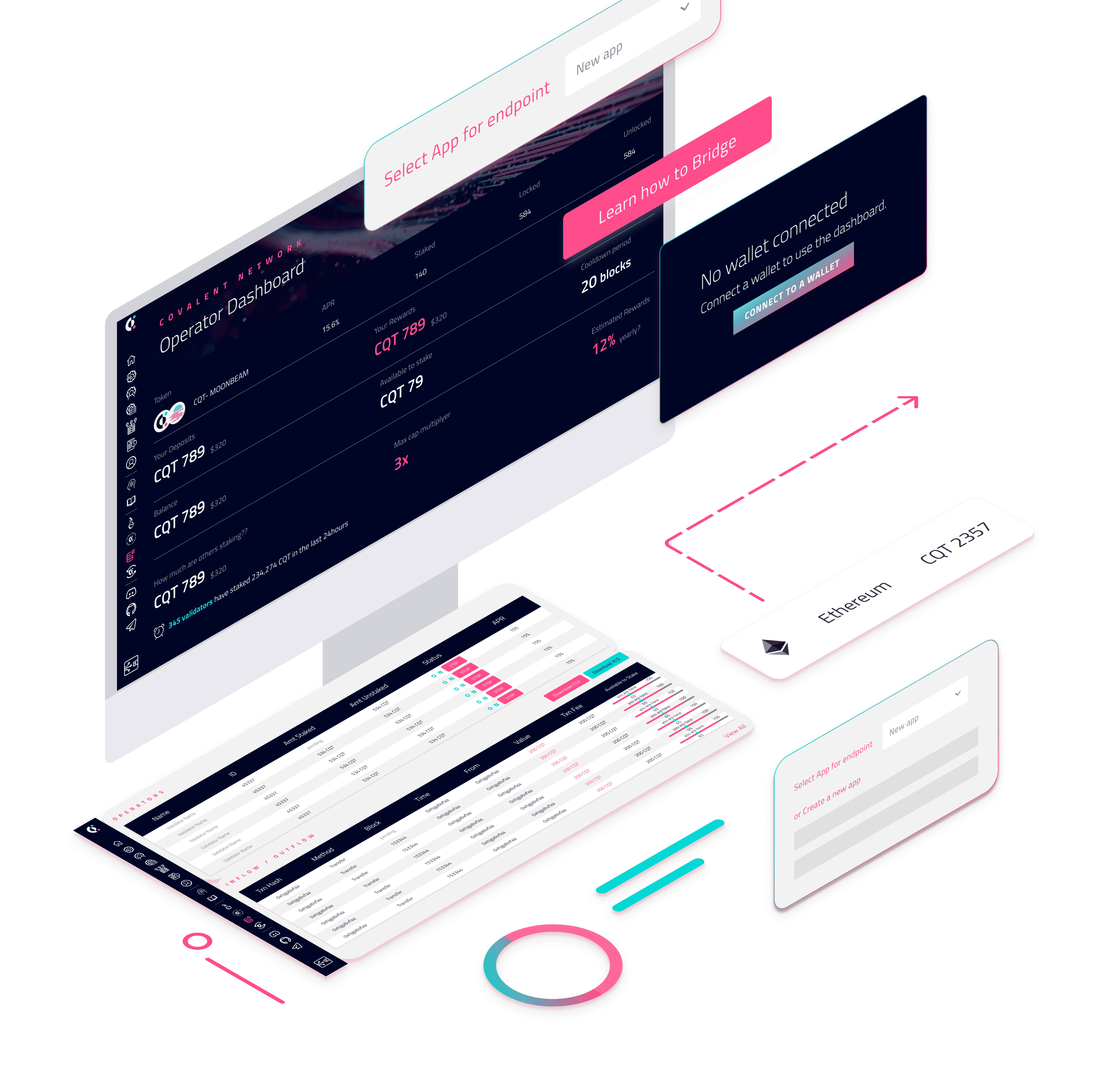
The operator dashboard for Web3 is designed to provide a clear and concise overview of earnings and staking options for validators.
The operator dashboard for Web3 is designed to provide a clear and concise overview of earnings and staking options for validators.
The operator dashboard for Web3 is designed to provide a clear and concise overview of earnings and staking options for validators.
The dashboard presents an easy-to-understand graphical representation of the validator's total earnings, broken down by time periods and individual transactions.
The dashboard presents an easy-to-understand graphical representation of the validator's total earnings, broken down by time periods and individual transactions.
It also highlights staking options and allows operators to manage their staking preferences from a single location.
It also highlights staking options and allows operators to manage their staking preferences from a single location.
Objectives and Goals
Objectives and Goals
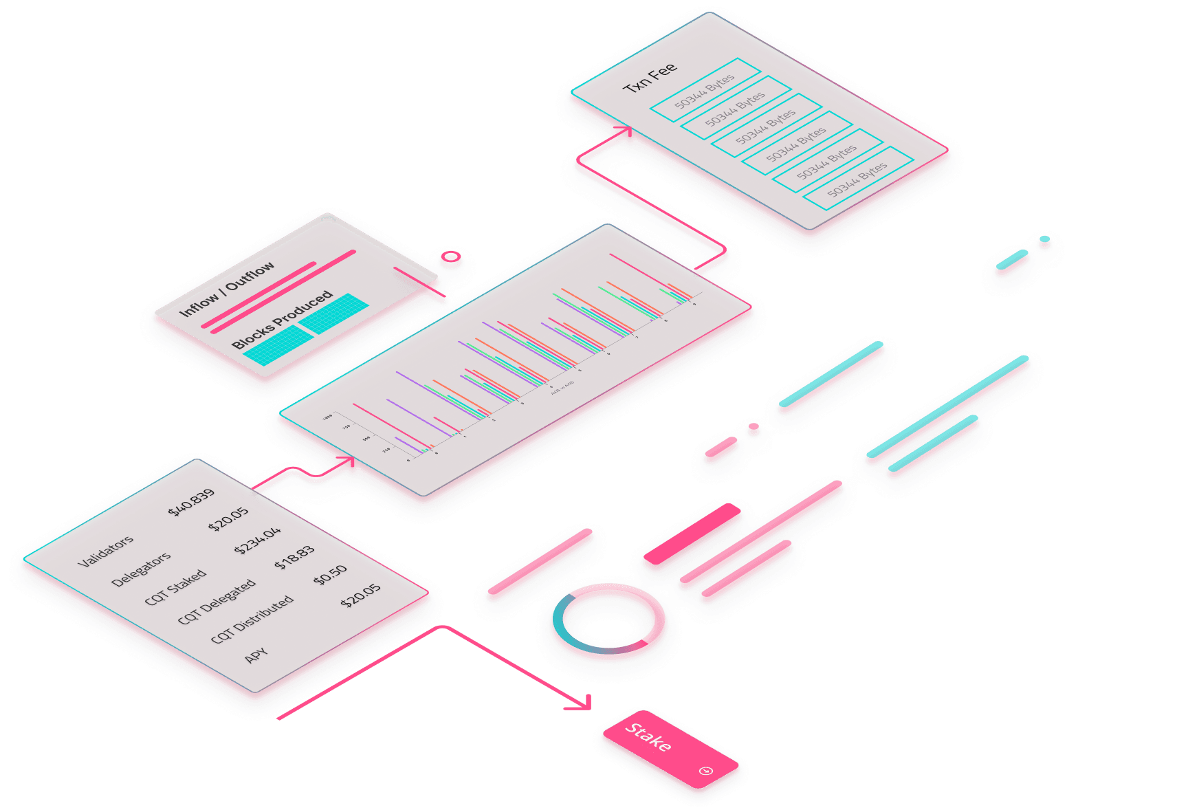
Currently there is no way for Operators / Validators to monitor their work and performance. By creating a Dashboard we aim to help Operators monitor the total blocks produced, total revenue earned, the total staking done, revenue multiplier, number of operators per delegators.
Currently there is no way for Operators / Validators to monitor their work and performance. By creating a Dashboard we aim to help Operators monitor the total blocks produced, total revenue earned, the total staking done, revenue multiplier, number of operators per delegators.
Currently there is no way for Operators / Validators to monitor their work and performance. By creating a Dashboard we aim to help Operators monitor the total blocks produced, total revenue earned, the total staking done, revenue multiplier, number of operators per delegators.
Business Challenge
Business Challenge
To remain elected as an Operator it is important to ensure that you have a high uptime by signing more than 2/3 blocks by their key.
To remain elected as an Operator it is important to ensure that you have a high uptime by signing more than 2/3 blocks by their key.
To remain elected as an Operator it is important to ensure that you have a high uptime by signing more than 2/3 blocks by their key.
As of now, we don't have a proper understanding of the time spent by Operators signing blocks, and in-turn we don't know if they have a high uptime. Elected as an Operator it is important to ensure that you have a high uptime by signing more than 2/3 blocks by their key.
As of now, we don't have a proper understanding of the time spent by Operators signing blocks, and in-turn we don't know if they have a high uptime. Elected as an Operator it is important to ensure that you have a high uptime by signing more than 2/3 blocks by their key.
As of now, we don't have a proper understanding of the time spent by Operators signing blocks, and in-turn we don't know if they have a high uptime. Elected as an Operator it is important to ensure that you have a high uptime by signing more than 2/3 blocks by their key.
Product Users
Product Users
Network Operators
Network Operators
Network Operators
Covalent Network Team
Covalent Network Team
Covalent Network Team
Token Holders
Token Holders
Token Holders
Delegators
Delegators
Delegators
Analysts
Analysts
Analysts
User Needs
User Needs
Network Operators need a Dashboard to quickly glance the network metrics.
Covalent wants to show network traction, and the best way to achieve this is through a dashboard where the users can see the metrics.
Network Operators need a Dashboard to quickly glance the network metrics.
Covalent wants to show network traction, and the best way to achieve this is through a dashboard where the users can see the metrics.
Network Operators need a Dashboard to quickly glance the network metrics.
Covalent wants to show network traction, and the best way to achieve this is through a dashboard where the users can see the metrics.
Research
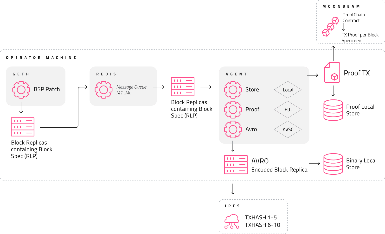
The first step of my design process for this particular challenge was to understand the entire Network Operator program.
I did a deep dive into the entire process of how does the Covalent Network work and what role does the Operator play in that.
To better understand this myself I started by creating a simple diagram of the working of the Covalent Network.
Low - fidelity Wireframes
Low - fidelity Wireframes
The aim of the design was to make the user interface intuitive, with minimal clutter and clear calls to action. The overall design was aimed at empowering operators to make informed decisions, while reducing cognitive load and increasing ease of use.
The most important part of this process was to identify the Information Hierarchy.
Dashboard
Dashboard


Proofs Tableboard
Proofs Tableboard

Prototype
Prototype
Feedback
Feedback
From our further research we understood that the users wish to get a more concise and brief format of all network metrics.
Users wanted information categorised in a better manner which led to the creation of three sections: Overview, Wallet Information and Analytics.
The users wanted the information to be prioritised.
Users wanted the dashboard to be more visual and less text heavy.
Low - fidelity Wireframes
Low - fidelity Wireframes
For the second round of iterations we worked on the feedback provided by the users and the Covalent team.
For this iteration we added more visual elements. Instead of rows of data in tables instead we added bar graphs, to show the wallet metrics of the Operator we used pie charts.
For the second round of iterations we worked on the feedback provided by the users and the Covalent team.
For this iteration we added more visual elements. Instead of rows of data in tables instead we added bar graphs, to show the wallet metrics of the Operator we used pie charts.
For the second round of iterations we worked on the feedback provided by the users and the Covalent team.
For this iteration we added more visual elements. Instead of rows of data in tables instead we added bar graphs, to show the wallet metrics of the Operator we used pie charts.

Proofs Tableboard
Proofs Tableboard

Final Design
Final Design
